-
Type:
New Feature
-
Resolution: Done
-
Priority:
Later
-
Affects Version/s: 7.0.6
-
Component/s: None
-
Security Level: Jimmy
-
None
-
ZK 8.6.0 S1, ZK 8.6.0 S2
-
None
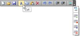
When a toolbar contains too many buttons, it will display multiple rows that doesn't fit some users expectation. The menubar has a scrollable feature to keep the menubar in 1 row. A toolbar should have a similar feature.
Another common design is to contain an overflow button (arrow icon) that show a popup which contains those buttons weren't able to fit in the toolbar like

